If you’re exploring ways to make your photography portfolio website more inclusive and attract new clients, you may feel overwhelmed about where to start. We’re here to help with simple, actionable steps for creating an inclusive and accessible site.
The term “inclusivity” might be seen and heard more frequently during Pride month each June, but the act of being inclusive can be demonstrated year-round. With Pride month just ended, celebrating the diverse community of LGBTQIA+ individuals in your community can continue in other ways. One way of showing your openness to a wide range of clients is taking the time to evaluate whether your photography portfolio website – the most public-facing image of your business – truly reflects inclusivity and accessibility.
Let’s take a look at how to evaluate your website and consider its outward-facing perception, then apply some tips for creating an inclusive and accessible website. Your current and prospective clients may feel more welcome if your photography website incorporates thoughtful wording and representations, along with enhanced accessibility to easily navigate your site and perform actions.
Inclusivity, accessibility and website design.
How can we best make our public image more inclusive? Most definitions of “inclusivity” start with the seemingly obvious premise of simply not excluding people or groups.
Inclusivity: the fact or policy of not excluding members or participants on the grounds of gender, race, class, sexuality, disability, etc.
source: https://www.dictionary.com/browse/inclusivity
With increased awareness of accessibility and inclusion, website designers are making strides to build websites that are optimized so that all viewers can accomplish the task(s) they came to the site to do. In the case of a photography website, that might include:
- exploring the homepage
- viewing a photography portfolio
- finding a photographer’s price rate
- contacting the photographer
- booking/scheduling a photographer for a shoot
- paying for a photo session, prints or products
Creating a site where visitors and potential clients feel welcome – seen – represented is the first step. Some things to keep in mind are the unconscious biases that can surface in our design, image selection, and language.
Is an accessible website an inclusive website?
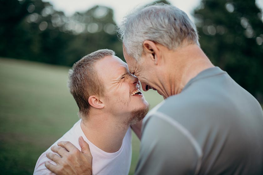
While inclusive and accessible design are often co-mingled terms, each is actually focused on achieving different goals.
Inclusive design works toward the goal that no group of individuals is excluded. Accessible design is a specific mechanization or set of functions for all types of individuals to easily navigate your site, thereby accomplishing the goal of inclusivity.
As you may already know, your website is essentially a dynamic document; it is continually edited and updated to be the best reflection of you and your business. Doing the work toward creating an inclusive and accessible website isn’t something that can be achieved overnight. We recommend setting aside time at least once a year to review and refresh portfolio and written content and optimize the navigation flow, although some creative professionals may find they need to update their site several times throughout the year. You can use the tips below as guidance while reviewing your current website and as you make future updates to your site.
10 tips for making an inclusive photography website.
The first step is to try to view your site from the client’s perspective. Ask yourself: “Will groups or individuals feel welcome when visiting my site?” Use the checklist below to guide you to building your inclusive photography website.
Design tips:
- Create and feature diverse images on your website.
- Optimize and be thoughtful with use of color and contrast.
- Don’t overcrowd the screen – keep your layout clear.
- Design with large buttons and headers.
- Provide captions for video content.
- Load transcripts for pre recorded audio.
- Consider using gender neutral terms and phrases.
- Implement inclusive security practices.
- Use alt text for images on all public pages.
- Test navigation from various devices for all user types.
Let’s take a closer look at how to implement each tip…
1. Create and use diverse images in your website.
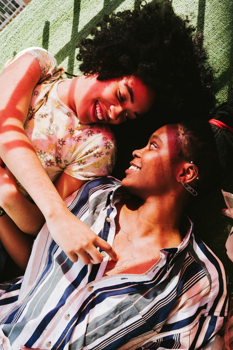
As a photographer, your images are your brand. They represent your expertise in a particular genre. Some photographers might specialize in landscapes or product shoots. If people are part of your work, this is a natural area to show potential clients that your brand is inclusive. When your homepage and portfolio images include couples and families who identify as LGBTQIA+ (Lesbian, Gay, Bisexual, Transgender, Queer, Intersex, Asexual), differently abled, or as part of the BIPOC (Black, Indigenous, and people of color) community, to name a few, this representation will make your site feel more welcoming to a broad range of individuals. Not sure where to begin? One way to broaden your portfolios is to offer free portfolio building sessions, model calls, or styled shoots within your travel range.
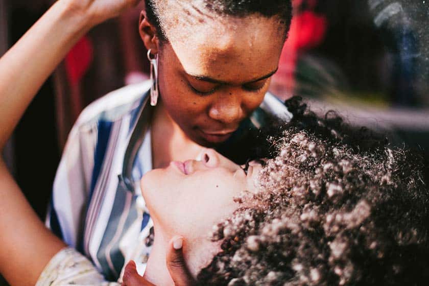
Photo credit: https://www.yolavi.net/
2. Optimize and be thoughtful with use of color and contrast.
It might take some trial-and-error to make this step successful. Practically, even if you do not experience an eyesight related disease or disorder, you can often see for yourself if a text/background color combo is more or less readable. It’s no surprise that white letters on a black background (or vice versa) is the most readable formula…but that might make for a boring brand palette. In some cases, as you use colored text on a colored background, the readability improves if the font size is increased.
An important thing to note in regard to choosing your brand and website design colors is that a significant portion of the population is affected by some form of color blindness. Although it disproportionately affects men (1 in 12 men are colorblind, compared to 1 in 200 women), you can provide better accessibility to all those with color blindness by staying away from the two most prevalent color combinations that are indistinguishable: red-green and blue-yellow. As for contrast, some web design experts advise a contrast ratio of at least 4.5:1 between text and background. You might find the WebAIM Color Contrast Checker a useful tool to create the best combo.
3. Don’t overcrowd the screen – keep your layout clear.
Clean, minimal website designs are trendy these days. There are several reasons for the appeal of minimal designs, including the dominance of mobile device users perusing websites on smaller screens. But an open, easy-to-view layout encourages scrolling and lessens anxiety from trying to take in multiple elements or information that isn’t presented in a clear visual hierarchy. Viewers with low vision will appreciate the accessibility of a clean screen design, and those with motor impairments will navigate easily if fewer clicks are required to accomplish a task.
4. Design with large buttons and headers.
When it’s important to make a point about your brand or prompt a website viewer to take an action, use large headers or headlines and large call-to-action (CTA) buttons. These large elements will readily catch the viewer’s eye, especially if presented in a clean, minimal field. Be sure to incorporate the color contrast rule to optimize readability for headers and buttons. Another useful tip is to avoid using text embedded in an image as the message might be more difficult to read over an image or become too small to absorb on mobile device screens.
5. Provide captions for video content.
Videos with captions are not only more accessible for deaf viewers or those with hearing loss, but can often reinforce your message by presenting it in readable words accompanied by audio. Be sure videos you create use clear language, avoid overly complex phrases, figures of speech, or unnecessary jargon. It is also helpful to turn off “autoplay” on videos loaded into your website.
6. Load transcripts for pre recorded audio.
If your videos include spoken words, interviews or narration, you should include a full transcript for each video or audio recording on your photography website. Let’s say you create a video espousing your photo philosophy, approach to shooting a session, or client testimonials. Along with captions, include a button or link for viewers to read or download the transcript. This strategy can have the added benefit of elevating your SEO rankings as search engines discover keywords and phrases in your transcripts.
7. Consider using gender neutral terms and phrases.
As you progress through the pages of your photography website, it helps to be thoughtful of gender specific terms such as “male/female” or “he/she.” These terms might not represent all individuals in the LGBTQIA+ community or feel relatable for every site visitor. From your home page throughout all secondary pages, review the text for inclusivity and consider changing it to gender neutral terms or phrases.
For example, if you offer the services of a particular makeup artist for some sessions and you know their pronouns, you could refer to them by name or with their preferred pronoun (he/she/they.) Whereas in your client contracts, where each client’s gender is unknown, you could use couple terms such as Partner, Spouse, Celebrants, or Nearlyweds rather than the typical “Bride/Groom” combination. Reviewing your online contact forms and session booking fields and making some adjustments (as applicable to your business) can help potential clients feel welcome. Here are a few fields you might begin with:
- Partner name instead of husband/wife
- Wedding party instead of bridesmaids and groomsmen
- An open field where the client can share their pronouns, if they wish.
We share more in-depth tips on creating an inclusive client experience in our blog How To Be An LGBTQ2+ Inclusive Photographer.
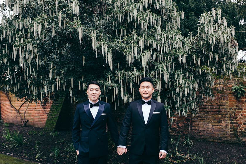
Photo credit: https://www.adamlloydwilson.com
8. Implement inclusive security practices.
If you have control over secure areas such as payment portals, review them for gender presumptions. It’s important to note that some third-party portals control the customer journey and you may not be able to change those settings. Certain multi-level security mechanisms might ask questions like, “what is your father’s birthplace?”, when the person filling out the form might have two mothers instead. Being cognizant of such a situation will help you avoid alienating a potential new client.
9. Use alt text images on public pages (homepage, portfolio, blog).
To provide accessibility to low-vision photography website viewers, add helpful and descriptive alternative text (alt text) for your public-facing images. For users who employ automated screen readers, alt text helps them fully understand what they are viewing. It’s easy to add alt text by applying the < alt > attribute within a HTML image tag, or to add them directly to your images in your portfolio website settings. Then, simply describe the image, any activity within the image, and the context of the image in the website content. If the image is decorative or has no relevance to the page content, just add an empty < alt > and screen readers will pass right over it without explaining.
10. Test navigation from various devices for all user types.
After implementing steps to improve accessibility, it is important to test navigation across an array of devices whenever possible – different screen sizes, desktops, tablets, phones – for ease of use by people who live with vision, hearing, and motor impairments. For example, keyboard navigation is vital for people with motor disabilities. When your photography website is optimized for keyboard navigation, users can more easily press a tab key or spacebar to take an action like playing a video or selecting a CTA option.
Review your site from other perspectives.
Hopefully, these 10 tips for making your photography website more inclusive will help guide you to build a site that is welcoming and accessible to everyone.
If you want to further explore making your website more accessible, check out the Web Content Accessibility Guidelines (WCAG) 2.0 for recommendations. The guidelines identify three levels of WCAG conformance:
- A – basic accessibility requirements satisfied
- AA – medium-scale accessibility requirements satisfied
- AAA – high-volume accessibility requirements satisfied
Another resource is the free tool WebAccessibility that scans your website and generates a report showing if your site is truly accessible, while highlighting any errors, alerts and functionality issues.
When thinking about the diversity, equity, inclusion, and accessibility of your photography website, try to put yourself in a visitor’s shoes. When you step back and envision what a person visiting your site might experience from their perspective, you will gain an understanding about the needs, challenges, and life situations of others, and provide a more welcoming website experience.
